Share of renewable energy production in the world
n this example, I examine data from the The National Bureau of Economic Research (NBER) on energy production in more than 150 countries since 1800.
The following is a description of the variables
| variable | class | description |
|---|---|---|
| variable | character | Variable name |
| label | character | Label for variable |
| iso3c | character | Country code |
| year | double | Year |
| group | character | Group (consumption/production) |
| category | character | Category |
| value | double | Value (related to label) |
Here, I load the relevant data.
technology <- readr::read_csv('https://raw.githubusercontent.com/rfordatascience/tidytuesday/master/data/2022/2022-07-19/technology.csv')

#get all technologies
labels <- technology %>%
  distinct(variable, label)

# Get country names using 'countrycode' package
technology <- technology %>%
  filter(iso3c != "XCD") %>%
  mutate(iso3c = recode(iso3c, "ROM" = "ROU"),
         country = countrycode(iso3c, origin = "iso3c", destination = "country.name"),
         country = case_when(
           iso3c == "ANT" ~ "Netherlands Antilles",
           iso3c == "CSK" ~ "Czechoslovakia",
           iso3c == "XKX" ~ "Kosovo",
           TRUE           ~ country))

#make smaller dataframe on energy
energy <- technology %>%
  filter(category == "Energy")

# download CO2 per capita from World Bank using {wbstats} package
# https://data.worldbank.org/indicator/EN.ATM.CO2E.PC
co2_percap <- wb_data(country = "countries_only",
                      indicator = "EN.ATM.CO2E.PC",
                      start_date = 1970,
                      end_date = 2022,
                      return_wide=FALSE) %>%
  filter(!is.na(value)) %>%
  #drop unwanted variables
  select(-c(unit, obs_status, footnote, last_updated))

# get a list of countries and their characteristics
# we just want to get the region a country is in and its income level
countries <-  wb_cachelist$countries %>%
  select(iso3c,region,income_level)
Plot comparison plot of bottom 20 and top 20 countries by proportion of total energy production contributed from renewable sources in 2019
# Create country's proportion of total energy production that stems from renewable sources
# We used 2019 data only

renewables_summary <- energy %>%
  select(-label) %>%
  filter(year == 2019) %>%
  pivot_wider(names_from = variable, values_from = value) %>% #Transform to wide form dataset
  mutate(renewables_proportion = round((elec_hydro + elec_solar + elec_wind + elec_renew_other) / elecprod, 3) * 100) %>% #Create proportion variable.  Take note that we round to 3 here to perfectly replicate the graph shown above. Any other value will return a slightly different plot
  arrange(desc(renewables_proportion)) %>%
  ungroup() %>%
  filter(renewables_proportion > 0)

# Extract top 20 countries by renewable energy proportion
top_20_renewables <- renewables_summary %>%
  slice_max(n = 20, order_by = renewables_proportion)

# Extract bottom 20 countries by renewable energy proportion
bottom_20_renewables <- renewables_summary %>%
  slice_min(n = 20, order_by = renewables_proportion)

# Store a plot of top 20 countries reordered on proportion
top_20_plot <- ggplot(top_20_renewables, aes(x = renewables_proportion, y = fct_reorder(country, renewables_proportion))) +
  geom_col(orientation = "y")  +
  scale_x_continuous(labels = scales::percent_format(scale = 1)) +
  labs(title = str_wrap("Highest % of renewables in energy production", 30), x = "Percent") +
  theme(plot.title = element_text(size = 12, hjust = 0.5),
        axis.title.x = element_text(size = 10),
        axis.title.y = element_blank(),
        axis.text.x = element_text(size = 10),
        axis.text.y = element_text(size = 5))

# Store a plot of bottom 20 countries reordered on proportion
bottom_20_plot <- ggplot(bottom_20_renewables, aes(x = renewables_proportion, y = fct_reorder(country, renewables_proportion))) +
  geom_col(orientation = "y")  +
  scale_x_continuous(labels = scales::percent_format(scale = 1)) +
  labs(title = str_wrap("Lowest % of renewables in energy production", 30), x = "Percent") +
  theme(plot.title = element_text(size = 12, hjust = 0.5),
        axis.title.x = element_text(size = 10),
        axis.title.y = element_blank(),
        axis.text.x = element_text(size = 10),
        axis.text.y = element_text(size = 5))

# Use patchwork package to create comparison plot
top_20_plot + bottom_20_plot +
  plot_annotation(title = "Highest and lowest % of renewables in energy production",
                  subtitle = "2019 data") +
  theme(plot.title = element_text(size = 14),
        plot.subtitle = element_text(size = 12))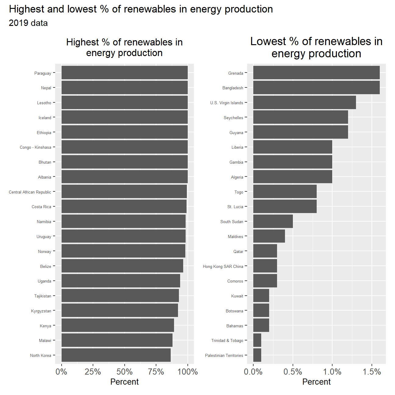
Animation of CO2 per capita emissions against deployment of renewables over time
# Rename columns in co2 dataset for ease
co2_percap <- co2_percap %>%
  rename(year = date) %>%
  rename(emissions = value)

# Create full dataset of energy, income and co2 emissions using join functions
energy_income_co2 <- energy %>%
  left_join(., countries, by = "iso3c") %>%
  left_join(., select(co2_percap, -c(iso2c, indicator, indicator_id)), by = c("iso3c", "year", "country")) %>%
  mutate(year = as.integer(year)) #Change year to integer so that the animation correctly reflects yearly change

# Create renewables proportion of countries across years
renewables_proportion_summary <- energy_income_co2 %>%
  select(-label) %>%
  pivot_wider(names_from = variable, values_from = value) %>% #Transform to wide data
  select(-c(elec_coal, elec_cons, elec_gas, elec_nuc, elec_oil, electric_gen_capacity)) %>% #ALL GOOD TIL NOW
  group_by(country, year) %>%
  summarise(renewables_proportion = (elec_hydro + elec_solar + elec_wind + elec_renew_other) / elecprod * 100,
            income_level = first(income_level), n = n(),
            emissions = mean(emissions)) %>%   #Create summary statistics that will be plotted
  filter(!(is.na(income_level))) %>%
  filter(year >= 1990)

# Plot faceted (income level) animation of emissions againsnt renewables proportion across years
ggplot(renewables_proportion_summary, aes(renewables_proportion, emissions, colour = factor(income_level))) +
  geom_point(show.legend = FALSE) + #Create scatterplot
  facet_wrap(~ income_level) + #Facet on incomem level
  scale_x_continuous(labels = scales::percent_format(scale = 1)) +
  labs(title = 'Year: {frame_time}',
       x = '% renewables',
       y = 'CO2 per cap') +
  transition_time(year) +
  ease_aes('linear') #Animation controls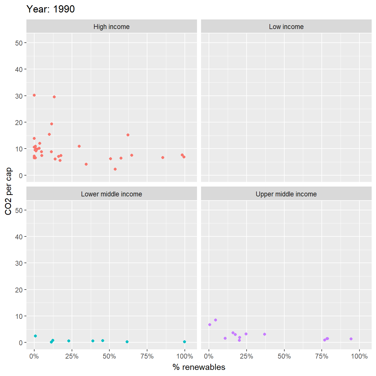
Observation and Analysis:
From observing the animation, 2 features are striking.
The first would be that we observe an inverse relationship between C2 emissions and % renewables; that is, when a larger proportion of a country’s energy production comes from renewable sources, the lower the CO2 emissions for that country and vice-versa. This is represented by the points that move along a north-west to south-east line in each of the income group plots. This can mostly be seen in all facets except “Low Income”; these countries had CO2 emissions that stayed pretty much constant no matter how their % renewables changed.
The second pattern we notice is that for countries in the High Income group, there exist a few select countries in which % renewable energy production proportion remained relatively constant despite CO2 emissions fluctuating drastically (CO2 emissions changed perhaps due to compliance to climate change regulations); these are also the same countries with the highest CO2 emissions amongst all other countries. Likewise, many other countries changed the extent to which they relied on renewable energy in their energy output but had no change to CO2 emissions; these were mainly countries with relatively lower CO2 emissions to begin with. This pattern implies that, for these countries, there exists almost no correlation between CO2 per cap and % renewables across time.