
Excess rentals in London TfL bike sharing
Here, I use data from London’s transport hub, TfL.
url <- "https://data.london.gov.uk/download/number-bicycle-hires/ac29363e-e0cb-47cc-a97a-e216d900a6b0/tfl-daily-cycle-hires.xlsx"

# Download TFL data to temporary file
httr::GET(url, write_disk(bike.temp <- tempfile(fileext = ".xlsx")))
## Response [https://airdrive-secure.s3-eu-west-1.amazonaws.com/london/dataset/number-bicycle-hires/2022-09-06T12%3A41%3A48/tfl-daily-cycle-hires.xlsx?X-Amz-Algorithm=AWS4-HMAC-SHA256&X-Amz-Credential=AKIAJJDIMAIVZJDICKHA%2F20220913%2Feu-west-1%2Fs3%2Faws4_request&X-Amz-Date=20220913T231812Z&X-Amz-Expires=300&X-Amz-Signature=8daf53bf545aeeb24c700bc5f023ce595a9af6cdefbb08a01ae6a0dde5d12a07&X-Amz-SignedHeaders=host]
## Date: 2022-09-13 23:18
## Status: 200
## Content-Type: application/vnd.openxmlformats-officedocument.spreadsheetml.sheet
## Size: 180 kB
## <ON DISK> C:\Users\ASUS\AppData\Local\Temp\Rtmpacg930\file38dc2a31474.xlsx# Use read_excel to read it as dataframe
bike0 <- read_excel(bike.temp,
sheet = "Data",
range = cell_cols("A:B"))
# change dates to get year, month, and weeks
bike <- bike0 %>%
clean_names() %>%
rename (bikes_hired = number_of_bicycle_hires) %>%
mutate (year = year(day),
month = lubridate::month(day, label = TRUE),
week = isoweek(day))In this example, I first use the mean to calculate expected rentals . In this case, I wanted to smooth (by averaging) all of the data, including anomalies, across the years for rentals within each month/week; this gives a clearer picture of an “average” for each time period since the median statistic would automatically exclude the effects of outliers.
Plot monthly rental faceted by year
I first create a mean expected rental from years 2016 to 2019 as reference. I then tabulate bicycle rentals from 2020 to 2022 to see how monthly bike rentals have changed since the onset of coronavirus.
# Create expected monthly bike rental by averaging monthly data from 2016-2019
expected_monthly_rental_summary <- bike %>%
  filter(year >= 2016 & year <= 2019) %>%
  group_by(month) %>%
  summarise(expected_rental_mean = mean(bikes_hired, na.rm = TRUE))

# Create actual monthly bike rental data from 2017-2022
monthly_summary_17_22 <- bike %>%
  filter(year >= 2017) %>%
  group_by(year, month) %>%
  summarise(monthly_mean = mean(bikes_hired))

# Join both tables
monthly_full_summary <- monthly_summary_17_22 %>%
  left_join(y = expected_monthly_rental_summary, by = "month")

# Plot monthly changes in bike rentals faceted on year
ggplot(monthly_full_summary) +
  geom_line(aes(x = month, y = monthly_mean, group = year), colour = "black", show.legend = FALSE) + #Line created for actual bike rental
  geom_line(aes(x = month, y = expected_rental_mean, group = year), colour = "blue", size = 1.2, show.legend = FALSE) + #Line created for expected bike rental
  facet_wrap(~ year) +
  geom_ribbon(aes(x = month, ymin = monthly_mean, ymax = pmax(monthly_mean, expected_rental_mean), group = year, fill = "red"), alpha = 0.3, show.legend = FALSE) + #Ribbon created for expected>actual
  geom_ribbon(aes(x = month, ymin = expected_rental_mean, ymax = pmax(monthly_mean, expected_rental_mean), group = year, fill = "green"), alpha = 0.3, show.legend = FALSE)  + #Ribbon created using actual>expected
  scale_fill_manual(values=c("green", "red"), name="fill") + #change colour fill of ribbons
  labs(title = "Monthly Changes in TfL bike rentals", subtitle = "Change from monthly average calculated between 2016 annd 2019", x = "Month", y = "Bike Rentals") +
  theme_light() +
  theme(plot.title = element_text(size = 14, hjust = 0.5),
        plot.subtitle = element_text(size = 12, hjust = 0.5),
        axis.title = element_text(size = 12),
        axis.text = element_text(size = 10),
        axis.text.x = element_text(angle = 90),
strip.text.x = element_text(size = 10)) 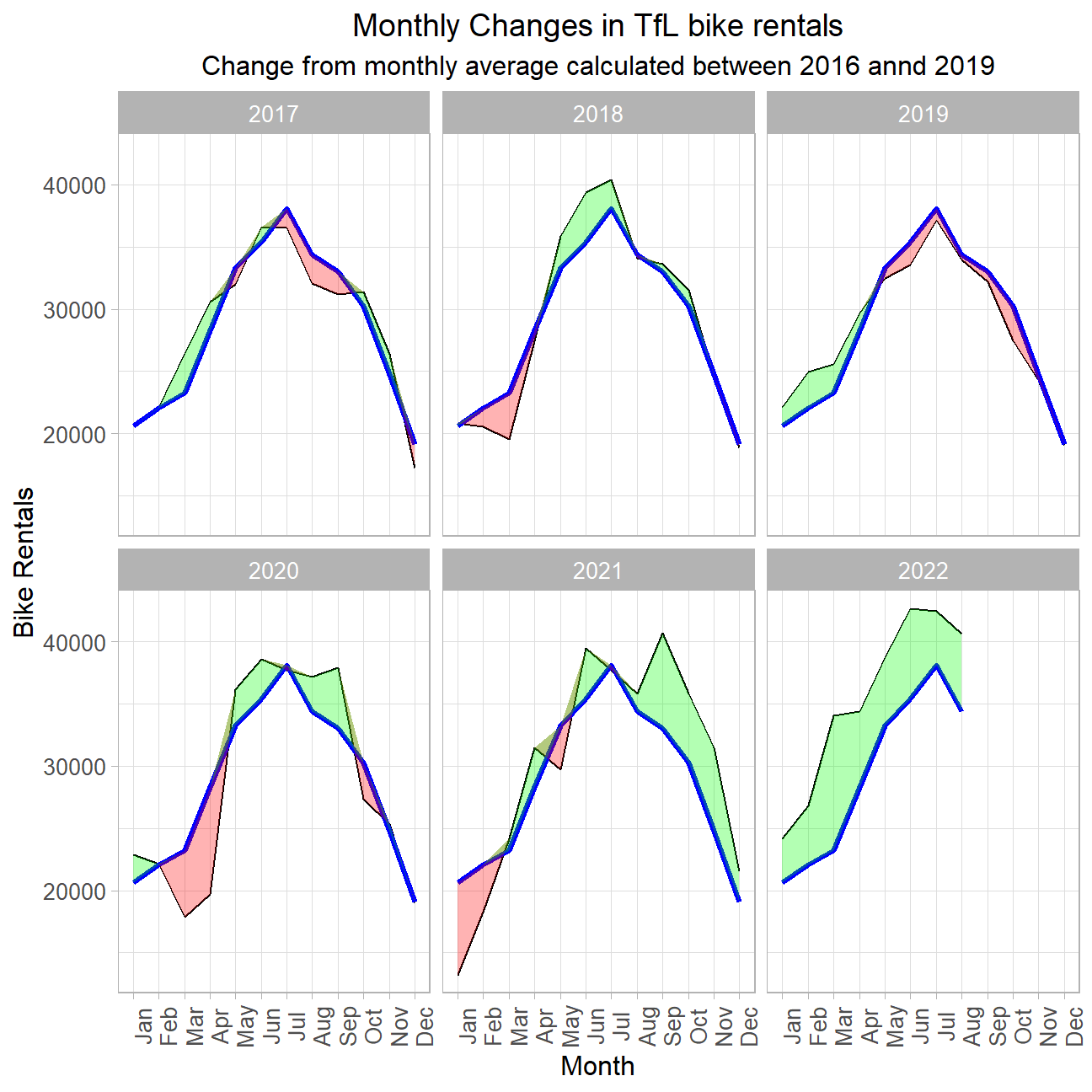
Plot weekly rental percent deviation faceted by year
I do the same thing here, except now with weekly data measured in terms of percent deviation.
# Create expected weekly bike rental by averaging weekly data from 2016-2019
expected_weekly_rental_summary <- bike %>%
  filter(year >= 2016 & year <= 2019) %>%
  group_by(week) %>%
  summarise(expected_rentals = mean(bikes_hired, na.rm = TRUE))

# Create actual weekly bike rental data from 2017-2022
weekly_summary_17_22 <- bike %>%
  filter(year >= 2017) %>%
  group_by(year, week) %>%
  summarise(weekly_mean = mean(bikes_hired))

# Join both tables and create new column measuring weekly percent deviation
weekly_full_summary <- weekly_summary_17_22 %>%
  left_join(y = expected_weekly_rental_summary, by = "week") %>%
  mutate(percent_change_weekly = (weekly_mean/expected_rentals - 1) * 100) %>%
  filter(!(week >= 52 & year == 2022)) %>% #filter date anomalies (due to the way R defines week 52 and 53)
  mutate(up = ifelse(percent_change_weekly > 0, 1, "")) %>%
  mutate(down = ifelse(percent_change_weekly < 0, 1, "")) #Create up and down columns for rugs later

# Plot weekly percent deviation in bike rentals faceted on year
ggplot(weekly_full_summary, aes(x = week)) +
  facet_wrap(~ year) +
  geom_rect(aes(xmin = 14, xmax = 26, ymin = -50, ymax = 100), fill = "grey", alpha = 0.1) + #Create rectangle representing Q2
  geom_rect(aes(xmin = 40, xmax = 52, ymin = -50, ymax = 100), fill = "grey", alpha = 0.1) + #Create rectangle representing Q4
  geom_line(aes(y = percent_change_weekly), show.legend = FALSE) +
  geom_ribbon(aes(ymin = 0, ymax = pmin(0,percent_change_weekly)), alpha = 0.3, fill = "red", show.legend = FALSE) +
  geom_ribbon(aes(ymin = percent_change_weekly, ymax = pmin(0,percent_change_weekly)), fill = "green", alpha = 0.3, show.legend = FALSE) + #Create ribbons
  geom_rug(data = subset(weekly_full_summary, up == 1), color = "green", sides = "b", show.legend = FALSE) + #Create green rugs
  geom_rug(data = subset(weekly_full_summary, down == 1), color = "red", sides = "b", show.legend = FALSE) + #Create red rugs
  scale_y_continuous(labels = scales::percent_format(scale = 1)) +
  labs(title = "Weekly Changes in TfL bike rentals", subtitle = "% change from weekly average calculated between 2016 annd 2019", x = "Week", y = "Bike Rentals") +
  theme_light() +
  theme(plot.title = element_text(size = 14, hjust = 0.5),
        plot.subtitle = element_text(size = 12, hjust = 0.5),
        axis.title = element_text(size = 12),
        axis.text = element_text(size = 10),
        strip.text.x = element_text(size = 10))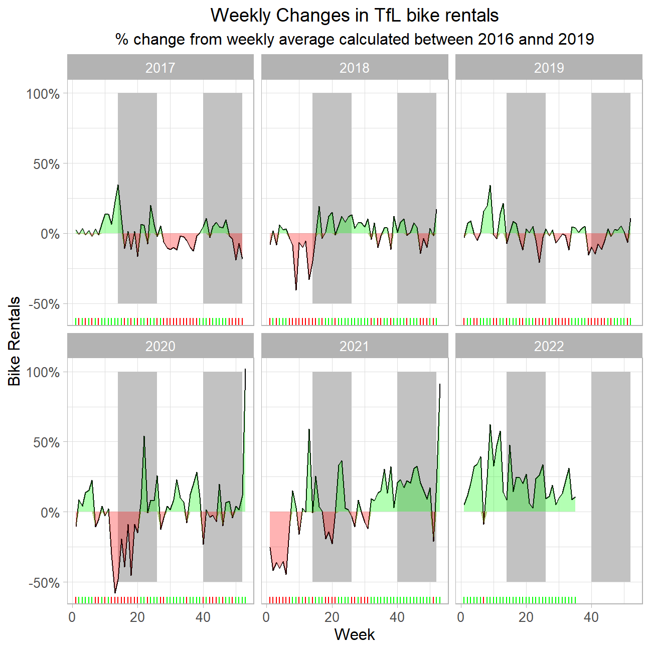
Observation:
We see that during the beginning of coronavirus lockdown periods, we observed a notable reduction in bike rentals. Conversely, past the lifting of general coronavirus measures in mid 2021, we have seen consistent positive excess rentals compared to the mean 2016-2019 bike rentals; this suggests that the local population was particularly inclined to get out of the house and into the fresh air by cycling more regularly. A similar pattern can be observed for the weekly analysis of bike rentals; bike rentals by more than 50%, as compared to the period from 2016-2019, in most weeks after the lockdown measures were lifted.