A study of GDP components over time and among countries
In this example, I will be examining the GDP components of select countries across time. The data is extracted from the United Nations’ National Accounts Main Aggregates Database, which contains estimates of total GDP and its components for all countries from 1970 to today. I will look at how GDP and its components have changed over time, and compare different countries and how much each component contributes to that country’s GDP.
UN_GDP_data  <-  read_excel(here::here("data", "Download-GDPconstant-USD-countries.xls"), # Excel filename
                sheet="Download-GDPconstant-USD-countr", # Sheet name
                skip=2) # Number of rows to skip
Tidying the data
Here, l first do a cursory examination of the data and also tidy it - by transforming the data into the long format.
# Create long form data
tidy_GDP_data <- UN_GDP_data %>%
  mutate(Shortind = gsub("\\s*\\([^\\)]+\\)","",as.character(IndicatorName))) %>% #Remove all characters after "(", inclusive
  mutate(Ind_id = gsub("\\b(\\pL)\\pL{2,}|.", "\\U\\1", as.character(Shortind), perl = TRUE)) %>% #Remove all characters after first letter of each word
  relocate(Ind_id, .after = Shortind) %>%
  pivot_longer(-c(CountryID, Country, IndicatorName, Shortind, Ind_id), names_to = "Year", values_to = "Values") %>%
  mutate(Values = Values / 1e9) %>% # Express figures in billions
  mutate(Year = as.numeric(Year))

# Check that length of unique indicators list matches that of unique short indicators list
indicators <- unique(tidy_GDP_data$IndicatorName)
shortindicators <- unique(tidy_GDP_data$Shortind)
ind_id <- unique(tidy_GDP_data$Ind_id)

# Create Ind_id to IndicatorName reference table
Indicators_table <- as.data.frame(cbind(ind_id, indicators))

# Check for obserevations with NA values
tidy_GDP_data %>%
  summarise_all(~sum(is.na(.))) %>%
  gather() %>%
  arrange(desc(value))
## # A tibble: 7 × 2
## key value
## <chr> <int>
## 1 Values 15421
## 2 CountryID 0
## 3 Country 0
## 4 IndicatorName 0
## 5 Shortind 0
## 6 Ind_id 0
## 7 Year 0# Cursory glance
glimpse(tidy_GDP_data)## Rows: 176,880
## Columns: 7
## $ CountryID <dbl> 4, 4, 4, 4, 4, 4, 4, 4, 4, 4, 4, 4, 4, 4, 4, 4, 4, 4, 4,…
## $ Country <chr> "Afghanistan", "Afghanistan", "Afghanistan", "Afghanista…
## $ IndicatorName <chr> "Final consumption expenditure", "Final consumption expe…
## $ Shortind <chr> "Final consumption expenditure", "Final consumption expe…
## $ Ind_id <chr> "FCE", "FCE", "FCE", "FCE", "FCE", "FCE", "FCE", "FCE", …
## $ Year <dbl> 1970, 1971, 1972, 1973, 1974, 1975, 1976, 1977, 1978, 19…
## $ Values <dbl> 5.56, 5.33, 5.20, 5.75, 6.15, 6.32, 6.37, 6.90, 7.09, 6.…# Let us compare GDP components for these 3 countries
country_list <- c("United States","India", "Germany")Plotting GDP components for 3 countries
I then select 3 countries to illustrate how the individual components that make up GDP change across time. Note here that the GDP value used was given within the dataset itself.
# Let us compare GDP components for these 3 countries
country_list <- c("United States","India", "Germany")
# Sieve out variables of interest
variables_of_interest <- c("GCF", "EGAS", "GGFCE", "HCE", "IGAS")
variables_with_descrip <-Indicators_table %>%
filter(ind_id %in% variables_of_interest )
df <- tidy_GDP_data %>%
select(-c(IndicatorName, Shortind)) %>%
filter(Country %in% country_list) %>%
filter(Ind_id %in% variables_of_interest)
# Plot components of GDP across time
ggplot(df, aes(x = Year, y = Values, group = Ind_id, colour = factor(Ind_id))) +
geom_line() +
facet_wrap(~ Country) +
labs(title = "GDP components over time", subtitle = "In constant 2010 USD",x = "Year", y = "Billion US$") +
scale_colour_discrete(name = "Components of GDP", labels = c("Exports", "Gross Capital Formation", "Government Expenditure", "Houesehold Expenditure", "Imports")) +
theme_light() +
theme(plot.title = element_text(size = 14, hjust = 0.5),
plot.subtitle = element_text(size = 12, hjust = 0.5),
axis.title = element_text(size = 12),
axis.text = element_text(size = 10),
axis.text.x = element_text(angle = 90),
strip.text.x = element_text(size = 10)) +
theme(legend.key.size = unit(0.5, 'cm'), #change legend key size
legend.key.height = unit(0.5, 'cm'), #change legend key height
legend.key.width = unit(0.5, 'cm'), #change legend key width
legend.title = element_text(size=10), #change legend title font size
legend.text = element_text(size=8), #change legend text font size
legend.position = "right")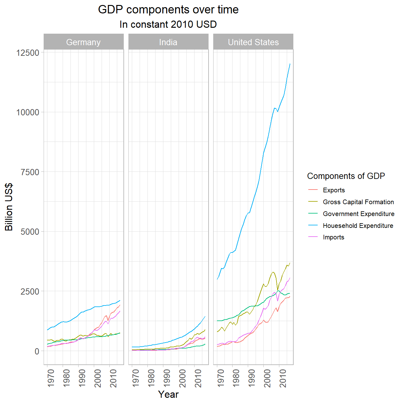
Plotting GDP components (proportion) for 3 countries
Next, I repeat my analysis above with 2 changes. Firstly, instead of the GDP value that was provided, I naively calculate GDP as a sum of Household Expenditure (Consumption C), Gross Capital Formation (business investment I), Government Expenditure (G) and Net Exports (exports - imports). In addition, I now calculate GDP components as a proportion instead of as an absolute value.
variables_of_interest2 <- c("GCF", "EGAS", "GGFCE", "HCE", "IGAS","GDP")
variables_proportion <- c("GCF_proportion", "HCE_proportion", "GGFCE_proportion", "NE_proportion", "GDP_delta_proportion")

manual_GDP_df <- tidy_GDP_data %>%
  select(-c(IndicatorName, Shortind)) %>%
  filter(Country %in% country_list) %>%
  filter(Ind_id %in% variables_of_interest2) %>%
  pivot_wider(names_from = Ind_id, values_from = Values) %>%
  mutate(NE = EGAS - IGAS) %>%
  mutate(GDP_manual = GCF + GGFCE + HCE + NE) %>% #Create GDP column by manually adding components
  mutate(GDP_delta = GDP_manual - GDP) %>%
  mutate_at(vars(HCE, GGFCE, GCF, NE, GDP_delta), funs(proportion = . / GDP * 100)) %>%
  pivot_longer(cols = -c(CountryID, Country, Year), names_to = "Ind_id", values_to = "Values") %>%
  filter(Ind_id %in% variables_proportion)

# Plot each GDP component's % composition of GDP over time
# Plot also includes a line that shows the % difference between what we calculated as GDP and the GDP figure included in the dataframe
ggplot(manual_GDP_df, aes(x = Year, y = Values, group = Ind_id, colour = factor(Ind_id))) +
  geom_line() +
  facet_wrap(~ Country) +
  labs(title = "GDP and its breakdown over time", subtitle = "In constant 2010 USD",x = "Year", y = "Proportion") +
  scale_y_continuous(labels = scales::percent_format(scale = 1)) +
  scale_colour_discrete(name = "Components of GDP", labels = c("Gross Capital Formation", "GDP % difference", "Government Expenditure", "Houesehold Expenditure", "Net Exports")) +
  theme_light() +
  theme(plot.title = element_text(size = 14, hjust = 0.5),
        plot.subtitle = element_text(size = 12, hjust = 0.5),
        axis.title = element_text(size = 12),
        axis.text = element_text(size = 10),
        axis.text.x = element_text(angle = 90),
        strip.text.x = element_text(size = 10)) +
  theme(legend.key.size = unit(0.5, 'cm'), #change legend key size
        legend.key.height = unit(0.5, 'cm'), #change legend key height
        legend.key.width = unit(0.5, 'cm'), #change legend key width
        legend.title = element_text(size=10), #change legend title font size
        legend.text = element_text(size=8), #change legend text font size
        legend.position = "right")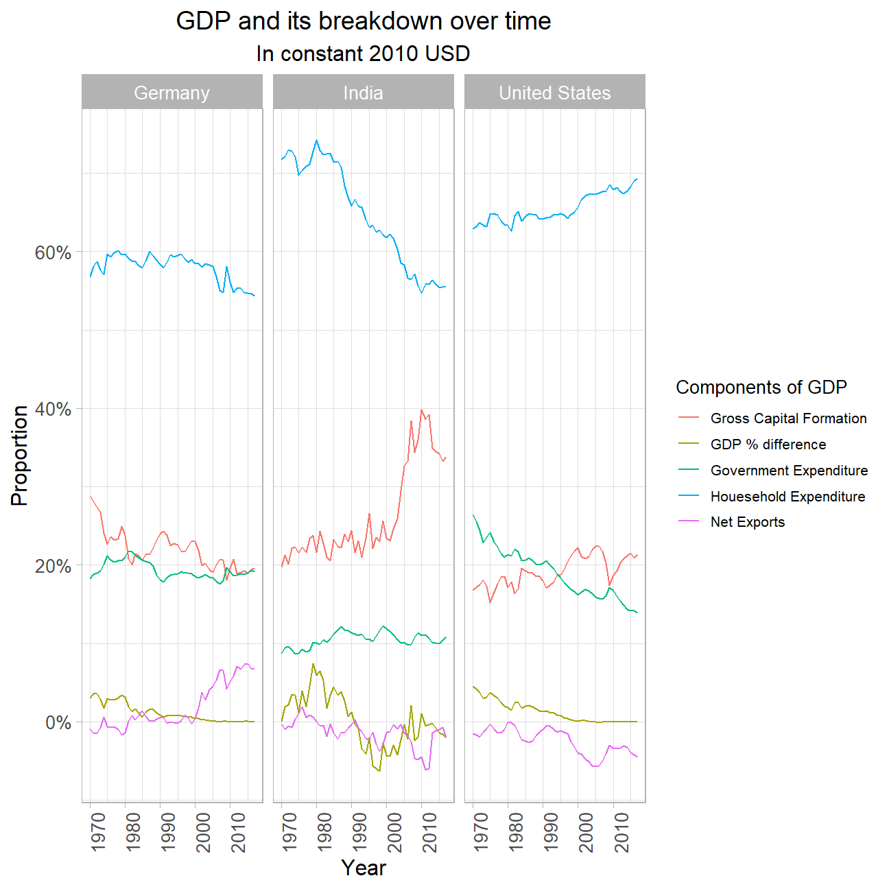
Analysis:
As the graphs show, there is a small, but undeniable difference between the sum of all GDP components and the UN reported total GDP value. This might be surprising at first, but as clarified earlier, the calculation of the GDP as the sum of government spending, consumption, investments plus the net exports is rather of a simplistic nature. Simultaneously, it is very difficult to estimate the exact values for each individual component of GDP. We believe that in order to calculate the various components, the UN might have used adjusted values for a better estimate. Similarly, to not be effected by the many assumptions made to calculate the individual components, the UN might have opted to extrapolate the GDP total value based on a different, more rigorous approach.
The graphs do hint at another anomaly. There is a clear difference between the countries in terms of the accuracy of the sum of GDP’s components and the UN’s reported GDP value. Whilst it seems as if the values for Germany and the United Stated have aligned with the reported GDP amount, the GDP estimate for India remains different until the present day. This might be down to the relatively high quality of data for Germany’s and the USA’s economy as opposed to the data on India’s economy. Therefore, the UN might have been forced to fall back on assumptions and estimations that lead to less accurate representations of the true values.
These graphs depict some noteworthy differences, similarities and trends. For all three countries, though very different, there is a strong tendency for the trade balance/ net exports to play a small part in the the countries GDP share. However, this does not imply that there are not significant differences in the magnitude of the im- and exports between these countries. Though, it does hint at the fact that despite all three countries having a strong industry (India’s natural resources and tech sector, Germany’s automobile and chemical industry and USA’s oil and automobile sector) all strongly depend on foreign goods to cover their domestic demand. Therefore the net exports’ GDP share are almost negligible. Only Germany, who has been up-scaling their exporting of automobiles to eastern countries and especially China has been realizing a positively developing share of net exports.
In the meantime, household spending makes up the largest share of GDP for all countries around the 60% mark. While Germany and the USA have been steady in this area for the last few decades, India has realized a 15% drop in its share. This might be down to an increasing share of household finances being used to spend on foreign goods as the middle class in India grows. Another explanation might be that through the relatively stronger increase in other components of the GDP the household expenditures’ share decreases a result.
The investments in India are an exemplary increase that might have caused the share of household expenditures to decrease. India’s size and resources make it an interesting trade partner for many other global powers and throughout the last 20 years India has felt an increasing investment in its country. This is observable in especially its tech sector and infrastructure. The growth of companies such as SPAN Infotech and Tata as well foreign investment by China through its silk road initiative are driving forces in this trend.
The government expenditure on the other hand is relatively low in India. USA and Germany have witnessed around 10% higher government expenditure relative to their GDP, as they have more established governmental structures and tax systems as well as social benefit systems that allow as well as require for higher relative government expenditure, respectively.
```